Form&Timber — Bespoke Furniture Atelier
"Custom furniture crafted with precision and intention."
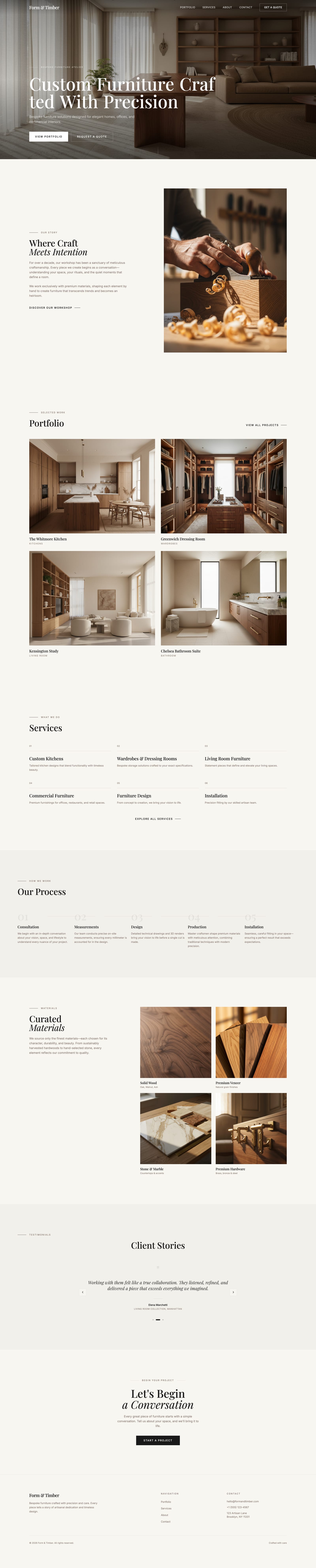
A premium single-page website for a bespoke furniture atelier — combining editorial serif typography, a warm linen palette and a clean scroll-driven layout to position custom craftsmanship as a luxury lifestyle choice.
Form&Timber — Full Page
sections — hero, about, portfolio, services, process, materials, testimonials, CTA
bespoke services presented (kitchens, wardrobes, living room, commercial, design, installation)
step production process — Consultation → Measurements → Design → Production → Installation
page — scroll-driven, no page reloads, full story in one flow
Homeowner / Interior Client
Professional aged 30–55 investing in custom furniture for a home or office. Values quality over price, wants to feel the brand before committing to a consultation.
Interior Designer
Independent designer sourcing bespoke furniture for client projects. Needs to quickly assess craftsmanship level, portfolio range and contact path.
- Editorial serif dominance — large Playfair/Cormorant headline creates luxury perception immediately
- Cream-on-cream palette — linen (#F5F0EB) background with dark brown accents signals warmth and premium craft
- Generous vertical rhythm — py-24 / py-40 section spacing lets imagery breathe and content feel considered
- Photography-led hierarchy — full-bleed hero and portfolio imagery carry the brand, text supports
- Minimal navigation — 4 links + 1 CTA button, no distraction from the brand story
- Process transparency — numbered 5-step flow builds trust by demystifying the bespoke journey
- Quote-focused conversion — two CTAs ("View Portfolio", "Request a Quote") guide the visitor funnel
- Testimonial social proof — editorial quote format with client name and project type builds credibility
- Consistent label system — small-caps section labels (BESPOKE FURNITURE ATELIER, OUR STORY, WHAT WE DO) create visual rhythm
- Footer completeness — contact details, navigation and brand statement present without clutter
Colour palette
Brand / Craft
Surface / Warm
Form&Timber
Display / Headings · Serif
Playfair Display
Hero headline, section titles, brand logo — editorial luxury
CRAFT
Section Labels · Sans-Serif Uppercase
Inter
Small-caps section labels, nav links, category tags
Aa
Body / UI · Sans-Serif
Inter
Body copy, service descriptions, footer text, CTA buttons
Spacing System
8px
Base grid unit
8 · 16 · 24 · 32 · 48 · 64 · 96 · 160px — generous luxury rhythm
Border Radius
0px
Sharp / minimal
No radius on images · subtle 2px on cards · full pill on buttons only
Motion
500ms
Default transition
200ms hover · 500ms section entry · ease-in-out scroll-driven
Accessibility
AA
WCAG 2.1 target
Dark brown on cream passes AA · light text on overlay verified
Hero
Editorial serif headline over a warm wood-toned living-room photograph with dual CTAs.
About / Story
Workshop photo, founder quote and values grid on a cream background.
Portfolio
Grid showcasing commissioned bespoke craftsmanship pieces.
Services
Numbered bespoke service with large photo and inquiry link.
Process
Five-step production flow from consultation to installation.
Materials
Warm tactile palette and texture samples for the build.
Testimonials
Editorial client quote format building premium credibility.
Contact
Serif headline, contact details and a project inquiry form.
Form&Timber is built around three core pillars — each driving a deliberate design decision that elevates the brand from a simple furniture website to a premium editorial experience.
Playfair Display at 64px signals luxury immediately. The serif/sans pairing — editorial headings over minimal body copy — communicates premium craftsmanship without a single image.
Sections breathe with py-24/py-40 spacing. No visual clutter, no competing elements. Every scroll reveals content with intention — making the visitor feel the brand's deliberateness.
The 5-step numbered flow demystifies bespoke commissioning — the biggest barrier to entry. Consultation → Measurements → Design → Production → Installation turns anxiety into anticipation.
Discover
- User interviews
- Competitor audit
- Problem framing
Define
- Personas
- User flows
- Information architecture
Design
- Wireframes
- Visual design
- Prototype
Validate
- Usability testing
- Iteration
- Handoff
Key findings
scroll-driven — the entire brand story, portfolio, services and process conveyed without a single page reload or navigation jump.
in the production process section — the clearest trust signal for bespoke clients who fear the "unknown" of commissioning custom work.
presented in a numbered grid — structured simplicity prevents cognitive overload while communicating the full range of expertise.
User voices
"We've had clients find us online and say the website felt like the furniture itself — precise, considered, nothing wasted. That's exactly the feeling we wanted."
Architect client, Brooklyn
"I could see the whole process before we even spoke. Knowing it went from consultation to installation in five defined steps made me feel confident commissioning something custom for the first time."
Homeowner, Manhattan
Key takeaways
- Single-page luxury sites need deliberate pacing — too many sections without enough whitespace collapses the premium feel
- Numbered process steps are high-trust signals for bespoke services — they reduce the "unknown" anxiety of commissioning custom work
- Editorial testimonial design (large italic quote + client + project type) outperforms star ratings in premium contexts
Next steps
- Add real project photography to the portfolio grid (currently using lifestyle imagery)
- Build a multi-page version with dedicated Portfolio, Services and About pages
- Integrate a quote request form with project type selector and budget range
- Add smooth scroll-triggered animations on section entry for a more refined experience
Form&Timber is a concept project — but designed with conversion-first thinking from the outset. These are the KPIs I'd track post-launch to validate the editorial luxury approach.
Quote Requests
≥ 15%
Visitors who click "Request a Quote" — the primary conversion signal for a bespoke atelier
Scroll Depth
≥ 80%
Users who reach the testimonials section — indicating the pacing and hierarchy hold attention through the full story
Time on Page
> 2 min
Average session duration — editorial luxury sites need dwell time to build brand perception
Return Visits
≥ 25%
Bespoke buyers typically research across multiple sessions before committing to a first conversation
All colour combinations were verified against WCAG 2.1 AA standards. The linen-on-dark-brown and dark-brown-on-cream pairings were tested throughout — the warm neutrals required extra care at smaller text sizes and muted opacities.
Contrast ratios
Body text on linen background
#2A1F14 on #F5F0EB
14.1:1
AAAHeading on section alt background
#2A1F14 on #E8DDD0
11.3:1
AAAWalnut muted text on linen
#8B6A4A on #F5F0EB
5.4:1
AALinen text on dark (footer)
#F5F0EB on #2A1F14
14.1:1
AAALinen on sand — decorative only
#F5F0EB on #C4A882
2.4:1
—Accessibility checklist
Keyboard navigation on all interactive elements (nav, CTAs, links)
Focus-visible rings on buttons and anchor links
All images have descriptive alt text
Touch targets ≥ 44×44px on mobile — CTA buttons and nav links
Semantic HTML — h1, h2, nav, section, footer hierarchy
No text conveyed by colour alone — labels accompany all visual states
Reduced motion support for scroll-triggered and hover animations
Screen reader testing (NVDA / VoiceOver)
Reduced motion and screen reader testing are flagged for the next iteration — both require a fully interactive prototype and assistive technology environment. The sand-on-linen decorative pairing is used only for non-text graphic elements and does not carry meaning.
Want to discuss this project?
Get in touch